How to Choose Nature Prints That Fit Your Living Room Style
Disclaimer: This article may contain affiliate links. If you purchase through these links, I may earn a small commission as an Amazon Associate—at no additional cost to you.
Nature-inspired wall art connects your indoor space with a sense of calm, freshness, and balance. For Indian homes especially, nature prints align well with vastu principles, mindful living, and clutter-free aesthetics.
According to interior design studies, natural elements in décor can reduce stress and improve mood by up to 15–20%, making living rooms feel more welcoming and relaxed.
From a practical angle, nature prints are:
- Timeless (they don’t go out of trend quickly)
- Easy to refresh with seasons
- Suitable for both rented and owned homes
This makes them a smart décor investment rather than a short-term styling choice.
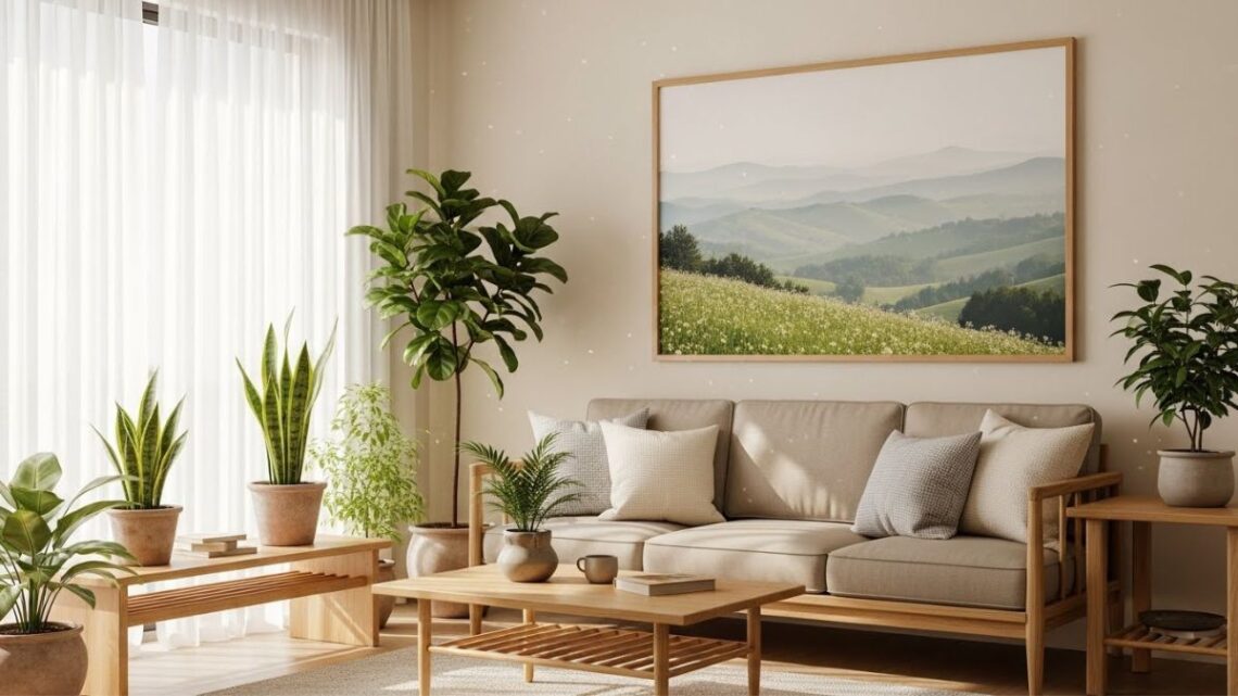
Match Nature Prints With Your Living Room Style
Minimalist Living Rooms
If your living room has clean lines, neutral colors, and less furniture, your wall art should follow the same philosophy.
Best choices:
- Soft landscapes (mountains, mist, water)
- Single-leaf or plant illustrations
- Muted colors like beige, sage green, grey
These prints enhance the space without overpowering it—perfect for mindful, clutter-free homes.
Modern & Contemporary Homes
Modern living rooms benefit from bold yet structured nature art.
Go for:
- Abstract interpretations of nature
- High-contrast photography (black & white forests, oceans)
- Large single statement prints
Such artwork adds personality while maintaining a sleek, sophisticated look—ideal for apartments and urban homes.
Cozy, Traditional, or Indian-Style Homes
Homes with wooden furniture, warm lighting, or ethnic elements pair beautifully with rich, detailed nature prints.
Try:
- Botanical illustrations
- Tropical plants, flowers, birds
- Earthy tones like terracotta, olive, mustard
These prints add warmth and complement Indian interiors without looking too modern or cold.
Choose the Right Colors (This Matters More Than You Think)
Color mismatch is the most common décor mistake homeowners make.
Use this simple rule:
- Match 60–70% of the artwork color with your existing room palette
- Keep 30–40% as contrast for visual interest
Example:
- Beige sofa → green or brown nature prints
- Grey walls → misty blues or soft greens
- Wooden furniture → botanical or forest themes
This ensures harmony while still making the art noticeable.
Pick the Right Size & Layout
Nature prints look best when they’re properly scaled.
Size Guidelines
| Wall Type | Ideal Print Choice |
| Large empty wall | One large statement print |
| Sofa wall | 2–3 medium prints (gallery style) |
| Small corner | Single compact framed print |
Avoid very small frames on large walls—they make the space feel unfinished.
Frame & Material: Small Detail, Big Impact
The same print can look completely different based on framing.
Recommended options:
- Wooden frames for warm, natural interiors
- Black or white frames for modern homes
- Canvas prints for relaxed, informal spaces
For Indian climates, choose moisture-resistant materials—especially if your living room gets sunlight or humidity.
Placement Tips for Maximum Visual Balance
- Hang art at eye level (not too high)
- Keep 6–8 inches gap above sofas or consoles
- Avoid overcrowding multiple walls with prints
A well-placed nature print becomes a focal point, not visual noise.
FAQs
How many nature prints should I use in one living room?
Ideally, use 1 large print or 2–3 medium prints. Too many artworks can make the space feel cluttered instead of calming.
Are nature prints suitable for small living rooms?
Yes. Choose light-colored landscapes or botanical prints. They create an illusion of space and make small rooms feel more open.
Do nature prints match Indian home décor?
Absolutely. Nature themes align well with Indian aesthetics, vastu principles, and traditional materials like wood and cotton.